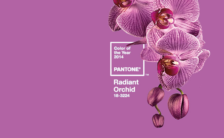
Pantone Color of the Year 2014 is Radiant Orchid – Another shade of purple
Its official. Pantone Color of the Year 2014 is Radiant Orchid.
“An enchanting harmony of fuchsia, purple and pink undertones, Radiant Orchid inspires confidence and emanates great joy, love and health. It is a captivating purple, one that draws you in with its beguiling charm.” Say the big guys at Pantone. I could not be more elated for I have been harping on how purple seems to be taking over our psyche.
This color was not what I expected though somewhere somehow it was always making its presence felt. It was not surprising when Pantone team said that Radiant Orchid is the color that will resonate around the world and is the reflection of what people are looking for, what they feel they need that color can help to answer.
Imbued with a harmony of fuchsia, purple and pink undertones, Radiant Orchid inspires confidence and its rosy undertones emanate great joy, love and health. Not necessarily the hot fashion color of the moment, but a color crossing all areas of design which is an expression of a mood, an attitude, on the part of the consumers.
I have blogged too much about purple and the shades therein. I will add no more here for I would like to see how this color comes forth and shows itself up. Flowers, mall window displays, fashion ramps, and more… Im looking for cues… to see if you are cued in.
Read more about this hungama here or even better, get your color codes, formula and guides here
My favorite way to reach Radiant Orchid is B163A3. I am impatient to see when and where I am going to use this code in my creations. That fills me with anticipation and angst. Cant wait.
Whats on your mind now with this color?




good color. i like it