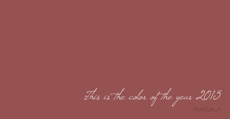
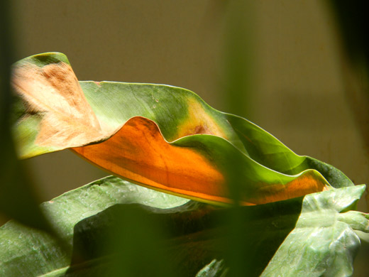
Pomegranates. Berries. Earth. Rust. Minerals. Flowers. Wine. Gems.
Its official. Marsala is the happening color of the year 2015. And I’m loving it.
“The charismatic and highly varietal shade of Marsala; a tasteful hue that embodies the satisfying richness of a fulfilling meal, while its grounding red-brown roots emanate a sophisticated, natural earthiness. Complex and full-bodied, this hearty, yet stylish tone is universally appealing; translating easily to fashion, beauty, industrial design, home furnishings and interiors.”
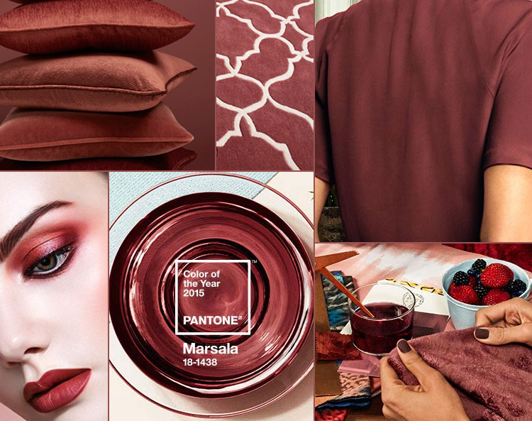
According to Pantone, the Versatility of Marsala is:
- Equally appealing to men and women, Marsala is a stirring and flavorful shade for apparel and accessories, one that encourages color creativity and experimentation
- Flattering against many skin tones, sultry and subtle Marsala is a great “go-to” color for beauty, providing enormous highlight for the cheek, and a captivating pop of color for nails, shadows lips and hair.
- Dramatic and at the same time grounding, the rich and full-bodied red-brown Marsala brings color warmth into home interiors
- An earthy shade with a bit of sophistication, texture is the story in print and packaging. A matte finish highlights Marsala’s organic nature while adding a sheen conveys a completely different message of glamour and luxury.
To distill the prevailing mood into a single hue, the Pantone Color Institute Team, led by executive director Leatrice Eiseman, combs the world looking for future design and color influences, watching out for that one color seen as ascending and building in importance through all creative sectors. They chose Marsala. And she nails it in this “why marsala video”. A must hear – must see interview for design enthusiasts.
On me or around me, I will be using Marsala for sure.
Now, where will it figure in your creations?


thanks for give me new inspiration.